Layout: boygenius Tour
boygenius is a supergroup comprised of Julien Baker, Lucy Dacus, and Phoebe Bridgers. Their debut album, the record, was released this year, and the band has started touring on the occasion.
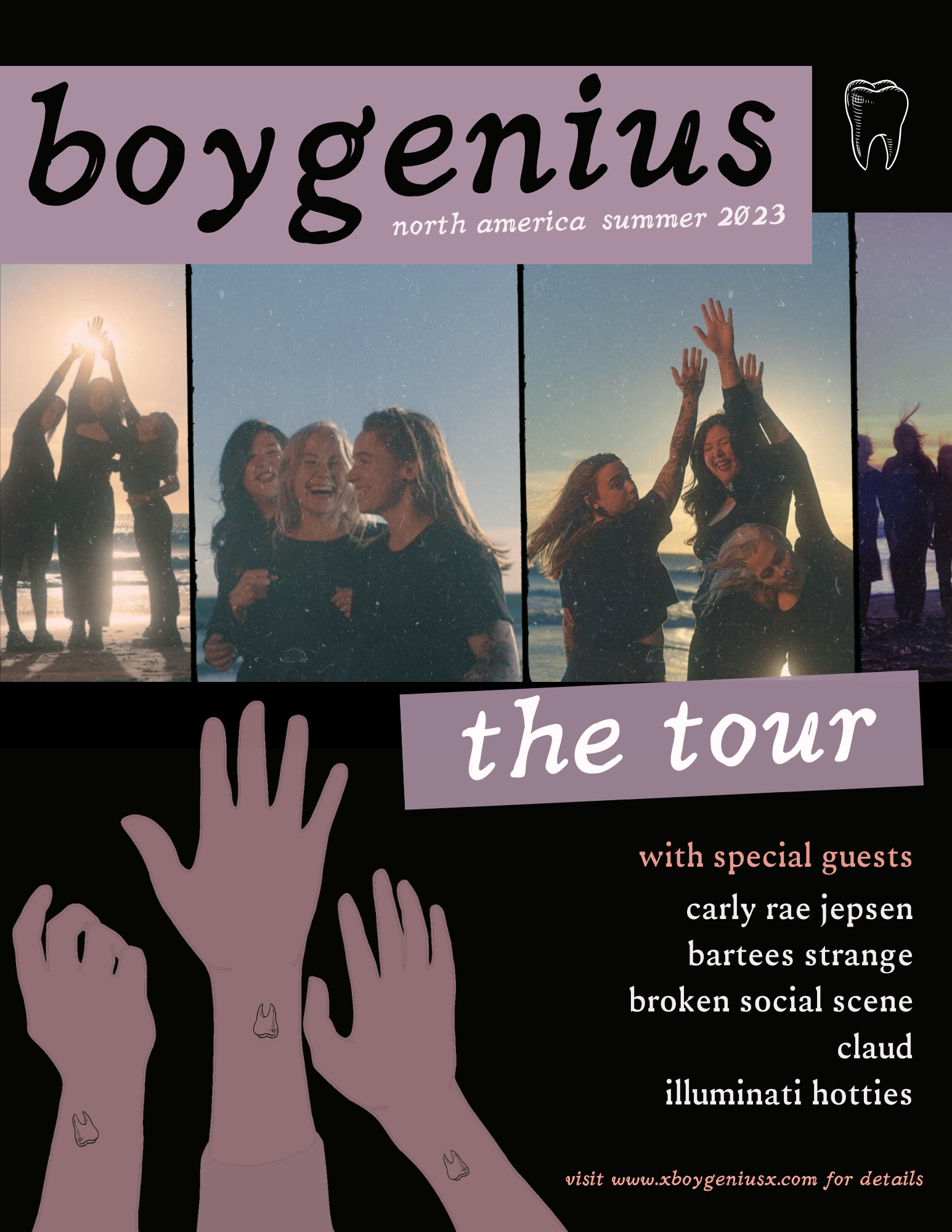
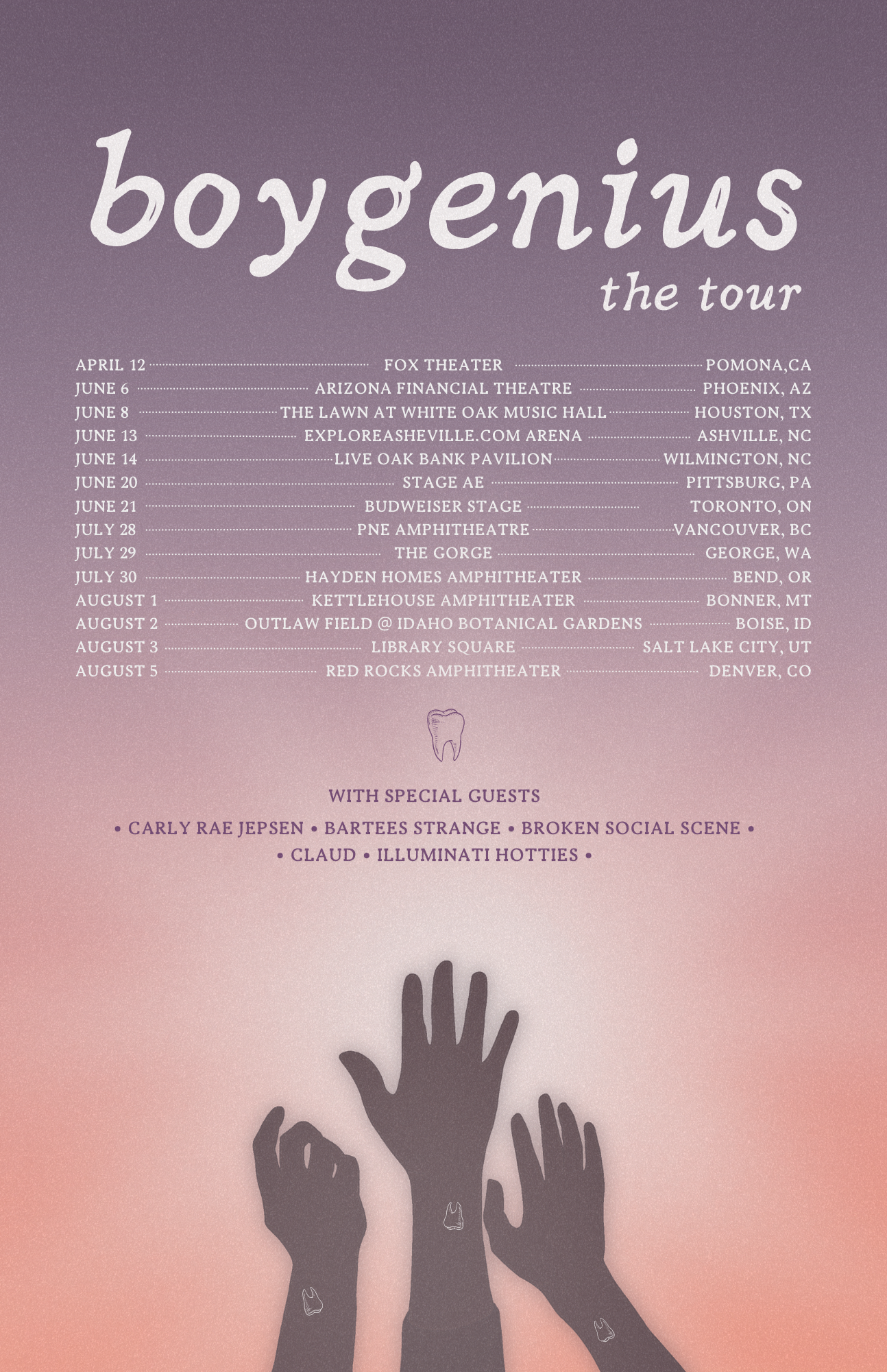
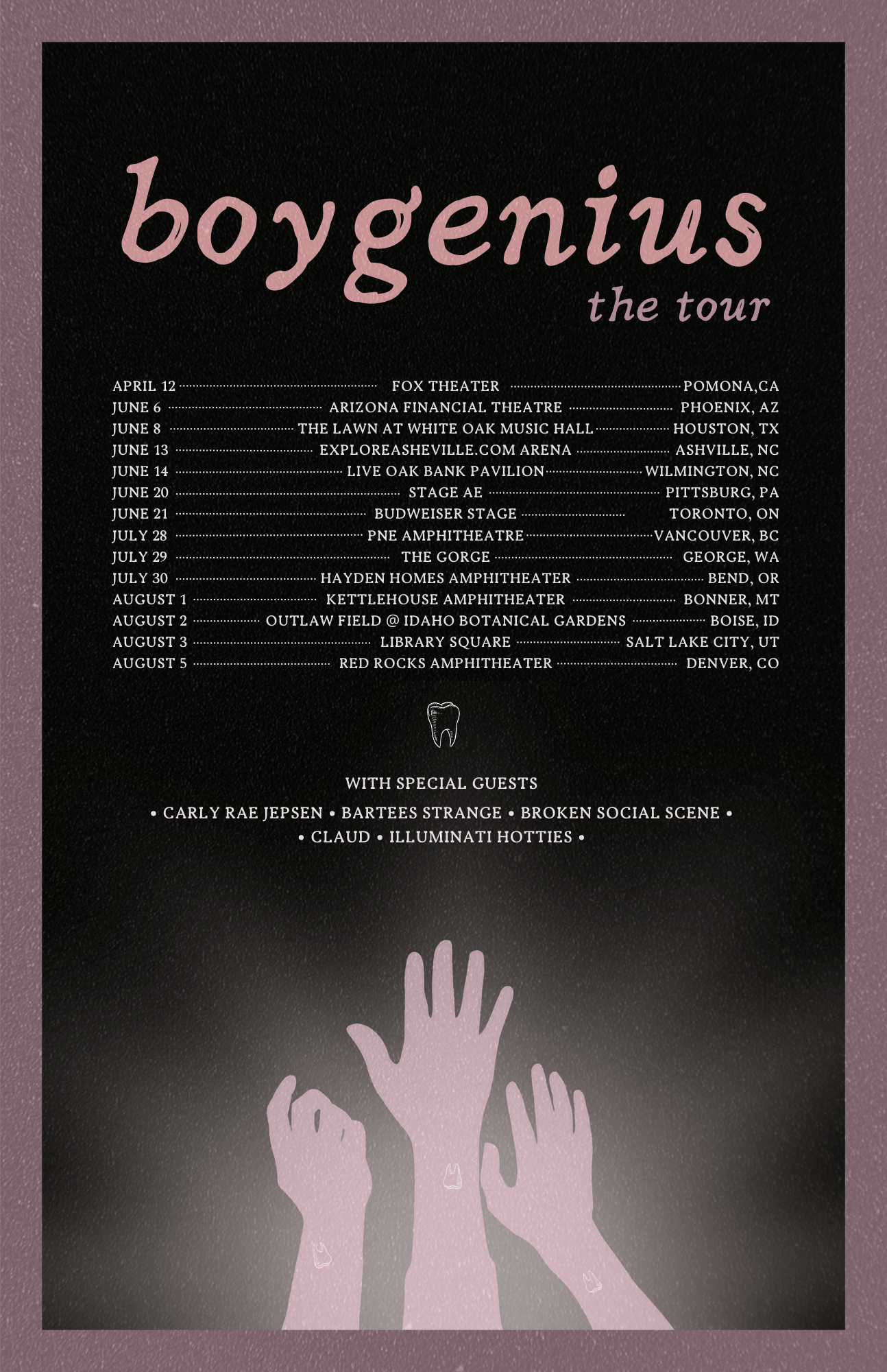
I created a package of flyers, posters, social media graphics, and merchandise to illustrate the group’s message and reflect the album’s imagery of dark sunsets, hands, their matching tooth tattoos, and lyrics using illustration, photo, typography, color, and various layouts.
In order to create this expansive package of designs, I used concepts of basic layout and hierarchy detailed in Cath Caldwell’s Graphic Design for Everyone.
Flyers and Posters:
For this component, I used color, image, illustration, and typography throughout these flyers and posters. In hierarchy, one must first rank the priority of each piece of information. For example, the band and tour name are always the largest components. Their name is always styled lowercase, so I deferred to that choice as opposed to the traditional uppercase to flag key information. I also incorporated photographs from the most recent album, hand drawn and selected imagery of the 3 members hands and the tooth tattoo they all have, and a hand-drawn style of typeface called Nadira for titles and a serif typeface for body text called Ireene.
Social Media: Icons, Posts, Banners
For the social graphics, I had to narrow down the most important information to keep the graphics clean and readable. I created a Facebook event banner with my illustrated hands along with two icons what alternated between using image and text. For the Instagram graphics, I created an animation of the three members’ hands with the title text for one, a photograph with title text for the next one, and finally a post with all the tour dates.
Merchandise: T-Shirt and Tote
This was probably my favorite part of the assignment because I was able to incorporate boygenius’s lyrics and corresponding imagery. I chose a line from the song “Not Strong Enough” that repeats at the outro: Always an angel, never a god. I used a linework illustration of three cherubs to illustrate the three members. Then I interpreted the repetition of the lyrics in my font with outlined versions of the lines echoing bolded versions of them on the top and bottom to create structure and hierarchy.
For the tote, I included options of the band and tour names with the hands I illustrated or tour dates.


