Designing with Color:
Milton Glaser Project and Event Posters
Milton Glaser
Project
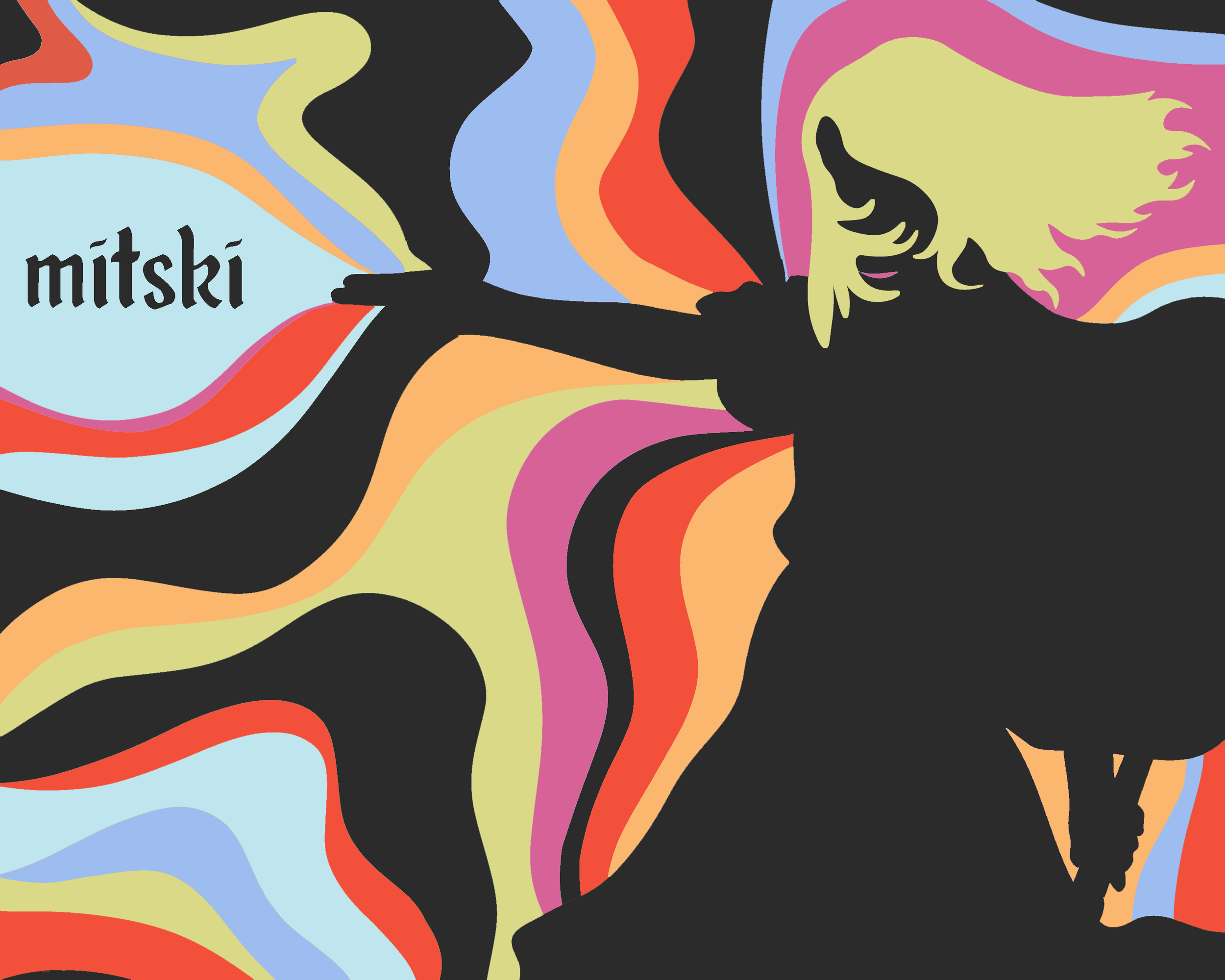
I chose to “Glaserize” my all-time favorite artist, Mitski because the imagery she markets her music with often consists of silhouettes. While browsing images of the artists, I thought of all the times I had seen Mitski live, and the elaborate choreography of her performances. It’s inspired by Butoh, “a type of Japanese dance theatre that often involves slow, hyper-controlled motions, exaggerated facial expressions, and a fixation on hard emotions and absurdity,” (Oliver Haug, i-D Magazine). It has become an integral part of her performance both live and in video and is tied to her Japanese roots.
The striking and symbolic forms Mitski creates through her choreography often includes slow and deliberate movements, perfect for this design exercise.
I settled on three different color palettes of varying styles. The first a monochromatic red, then a palette of complementary colors green and purple in varying shades, and finally Finally, I went for the widest range of colors, with a palette of complementary colors, red and green,turquoise and fuschia, and finally orange and blue.
See the results below!
Event Posters
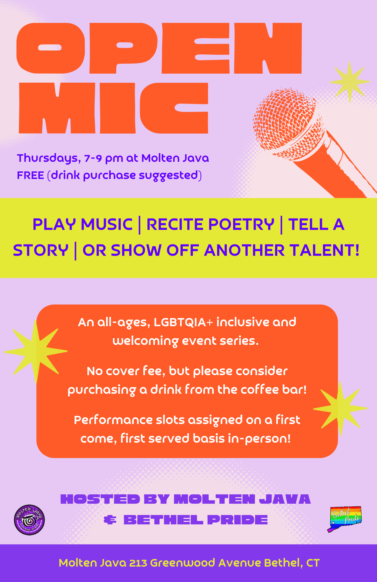
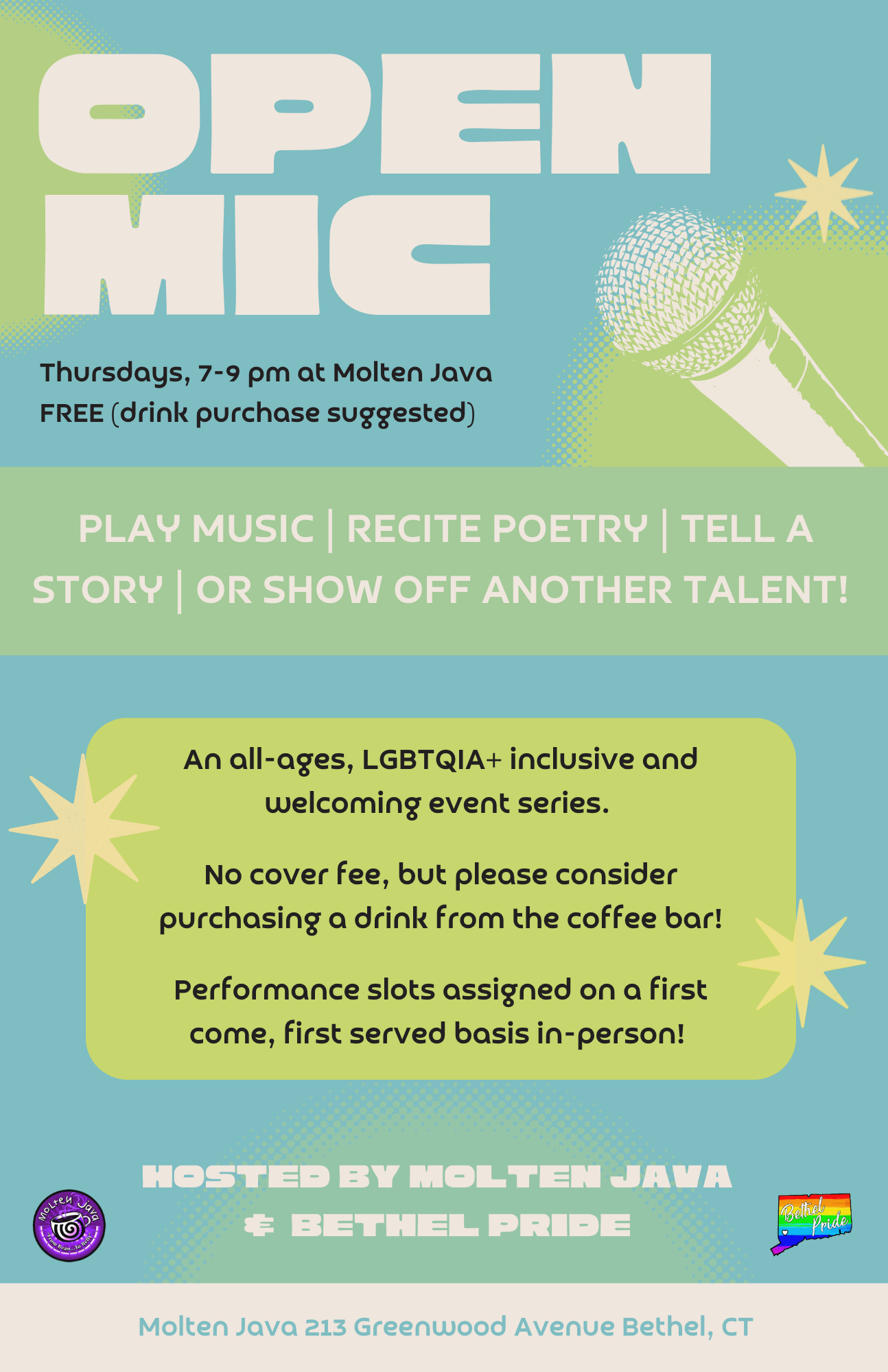
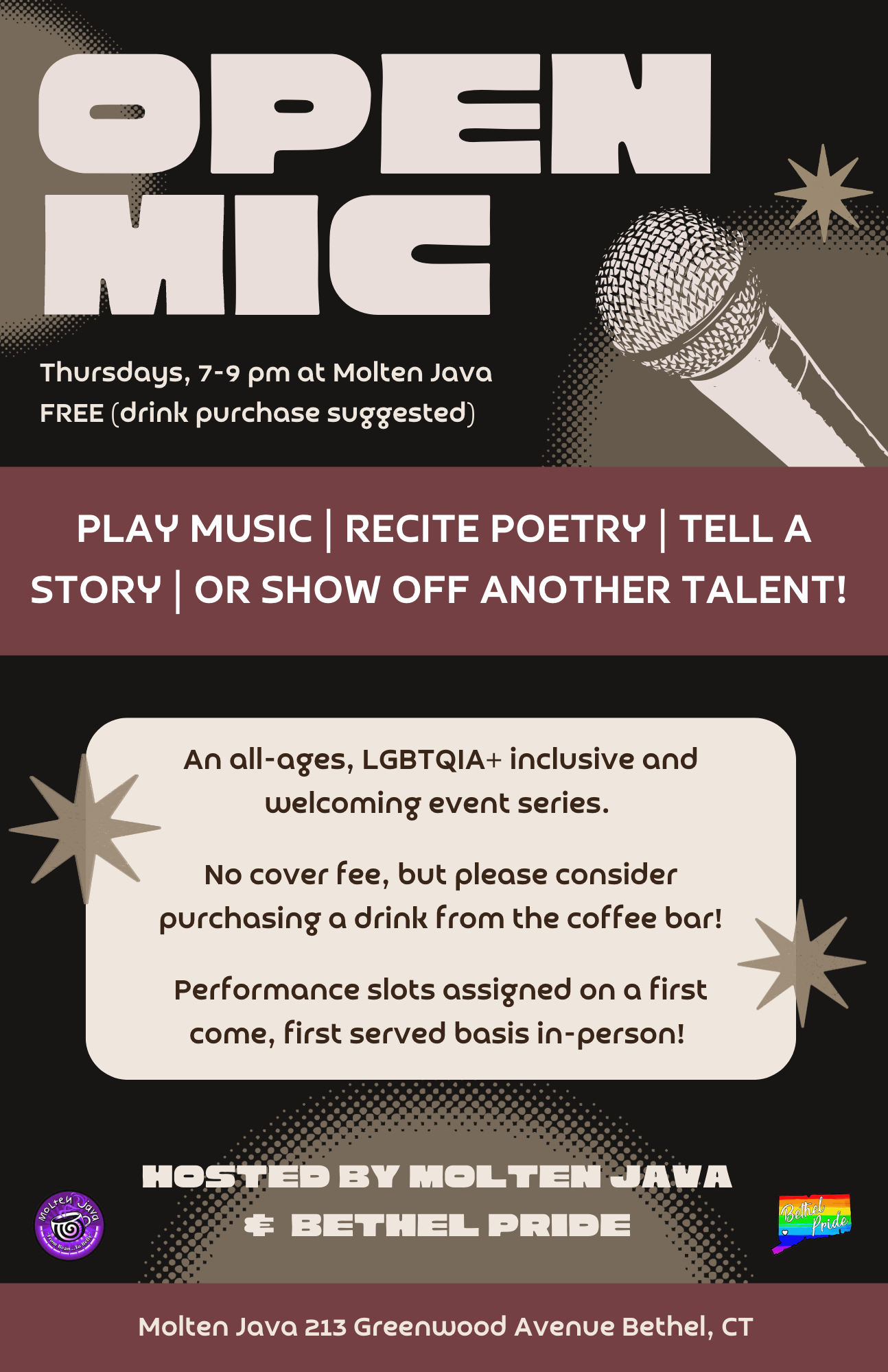
I created three different color palettes for a weekly open mic that runs near me.


