Working with Type
While exploring the ins and outs of type, I completed a series of projects that helped to understand the fundamentals of typography and font to a higher degree. First, I explored typography through matching fonts to moods, then I created a type specimen poster to break down the font, Agrandir’s abilities, and finally a business identity system for last week’s subject, Xondra.
Typography: Mood Fonts
I chose a series of six different words to explore what possiblities might arise from each and had a wonderful time getting creative with each! The words included were: flower, paint, portal, blaze, echo, and glitch. For each word, I started by finding fonts that evoke an emotion or certain imagery that matched the chosen word.
For example, with the word “flower” I chose a font that included actual flowers titled Fleuron and mixed the settings to alternate which letters would have flourishes to create the effect. Then I chose a font called Flower Power and used deconstructed elements like the exclamation point’s line and dot to create a flower to replace the O in the word. Finally, I used a font called MADE Sunflower and masked the text with an image of a flower. I had a lot of fun during the process of this exercise playing with different effects in Photoshop and Illustrator like 3-D, shadows, and masking! Scroll through to see what I came up with.
Type Specimen Poster: Agrandir
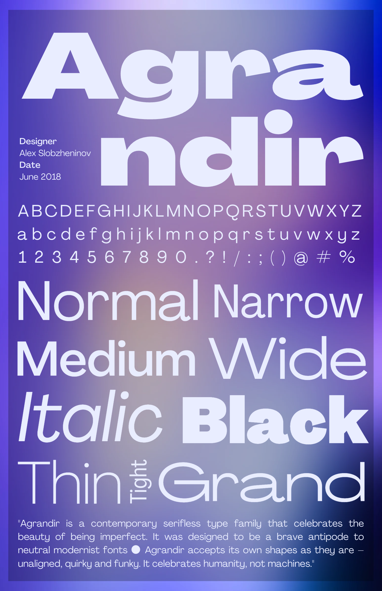
For this project, I studied the font Agrandir to create a type specimen poster. Agrandir is a very modern humanist sans serif font. The font takes the neutrality of a sans serif typeface, and makes it distinctive and fun. I explored the font’s origins from its backstory to its date of creation and creator, Alex Slobzheninov. Then I illustrated the different weights, forms, and widths in the font family to create this poster below.
Business Identity: Xondra
Finally, I continued last week’s project, creating a business identity for the artist, Xondra. I made a unique and uniformed set of items like business cards, posters, t-shirts and totes, and (my personal favorite) an album cover to play around with the brand kit of fonts, colors, and graphics to further shape her brand.


