Customizing Your Own Website
Designing your portfolio website can be a daunting task. There are so many components that can easily overwhelm people; such as which CMS to use, how you want to present yourself and your work, creating and curating what content to display, and then finally designing the actual site.
Take this website for example. I personally use Squarespace because it’s a CMS that I am both familiar with and has a lot of great features that makes it easy to achieve your website goals, design and functionality-wise. I originally made my website to function as my Master’s blog. However, as I continued to advance in my studies and work, I saw the potential that this website had to represent my projects, passions, and aspirations. When I first approached the idea of redesigning my website, I felt a bit stuck. I was already attached to the version I had made previously and I didn’t think there was much room for improvement. However, when I started to research more about what makes a website stand out, I started to think of new and exciting ways to make my blog even better than before.
Here is what my website originally looked like:
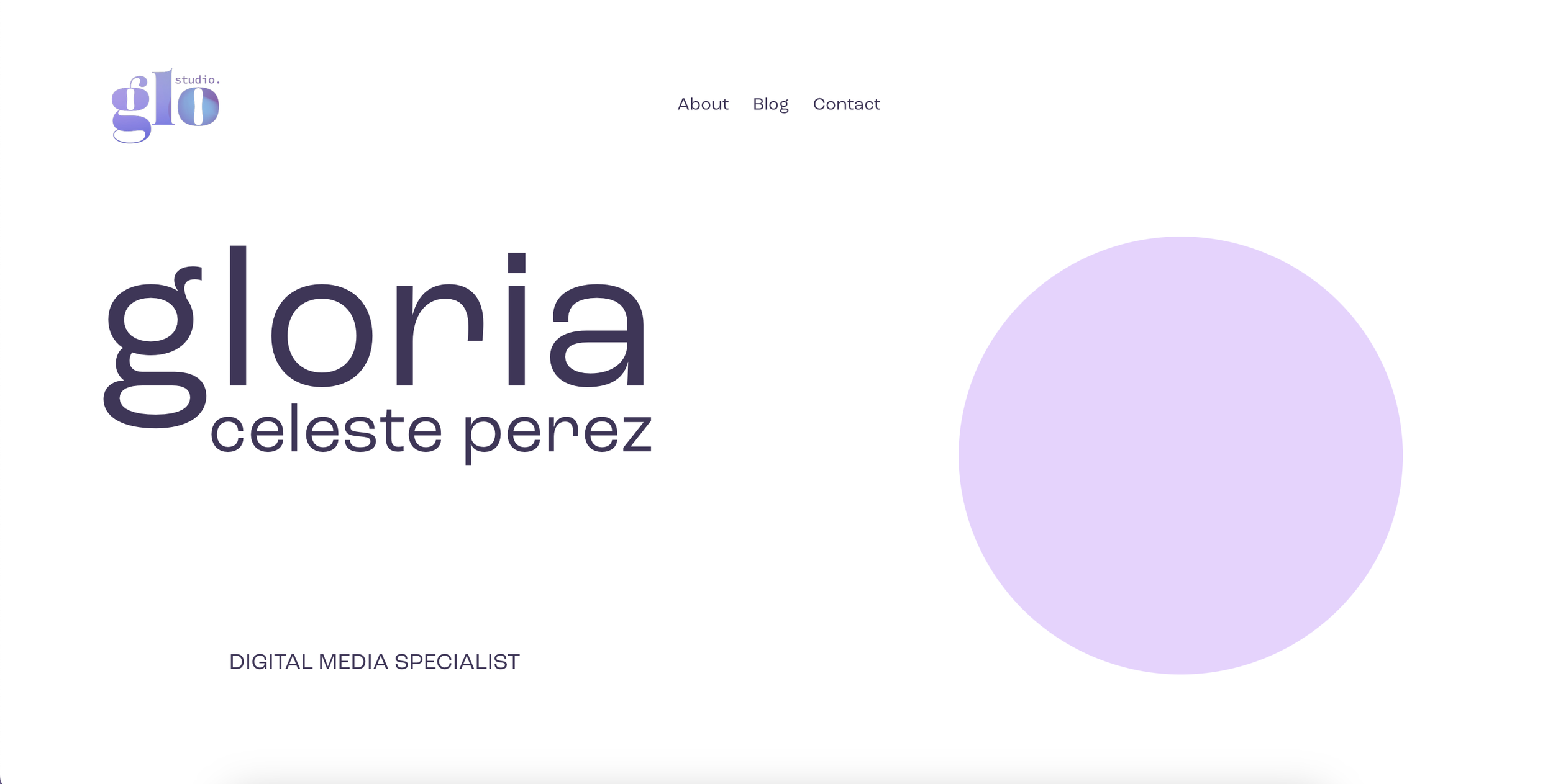
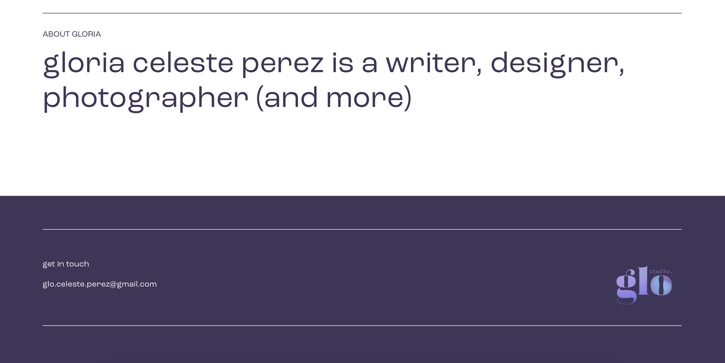
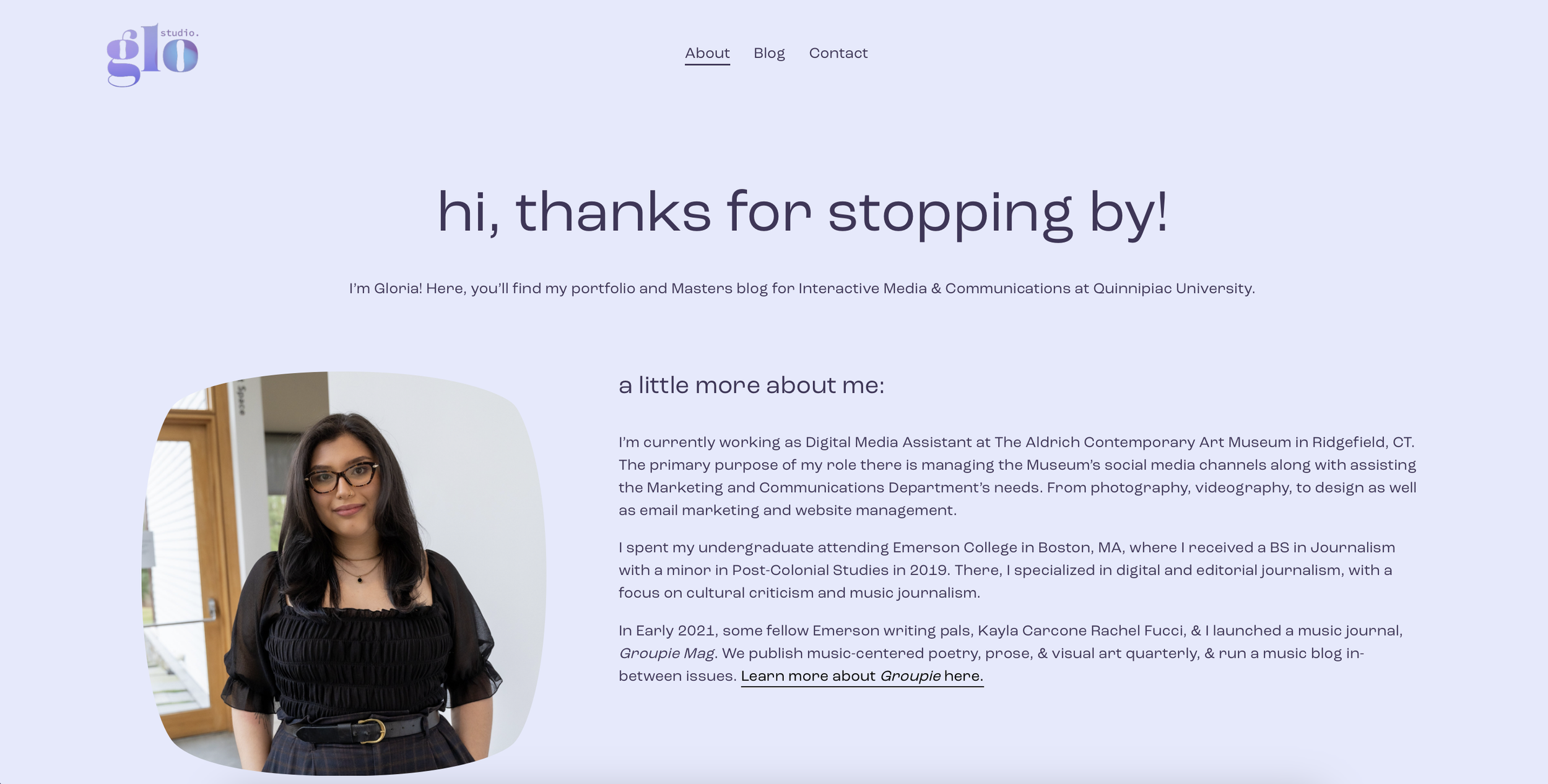
It was clean and simple which I liked. I tried to maintain a similar minimalist structure as I went through the customization process, but I also noticed some major areas that were lacking. I decided that for this process, I wanted to showcase examples of my work and portfolio; display my blog on the homepage; and illustrate my personality, aesthetic, and growth as a designer.
Here are the steps I took to optimize my website to what it is now:
I took note of what design choices looked clunky or served no real function. For example, my homepage was quite sparse and didn’t feel as purposeful as I wanted it to. I had a brief description of what I do along with some design choices that were purely for aesthetic, like the purple circle in the first image. I knew I was using the shape to add some color and dimension to the website, but I started to think about what I could use instead to introduce myself to visitors.
I thought about maybe using a headshot, but the one I had felt a bit out of place on the page. I ended up drawing a digital illustration of myself to give visitors a face to the name while also incorporating my design skills. I also displayed some of my work from past classes and my own professional background to give the user a look into what I do. Finally, I displayed my blog on the homepage to give that section of my website more of a presence.
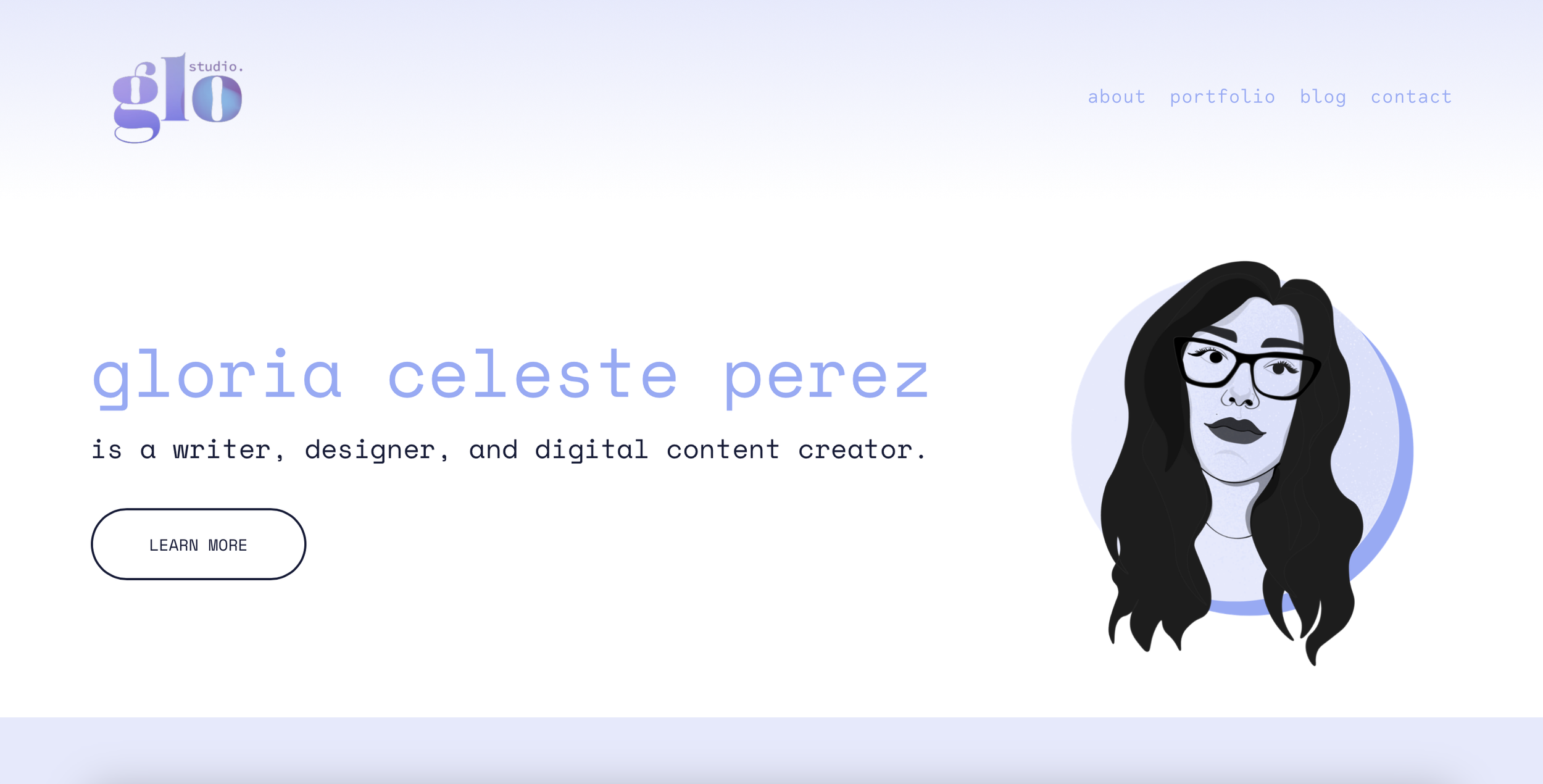
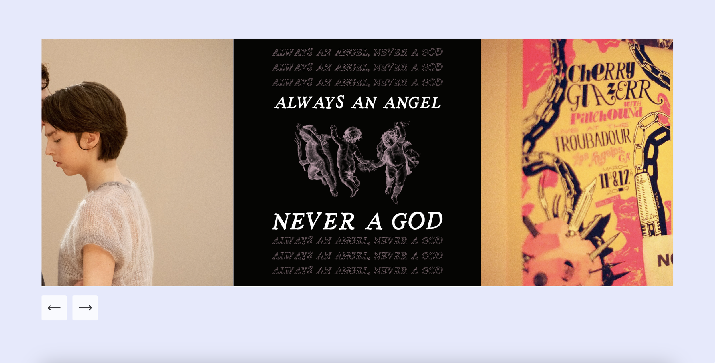
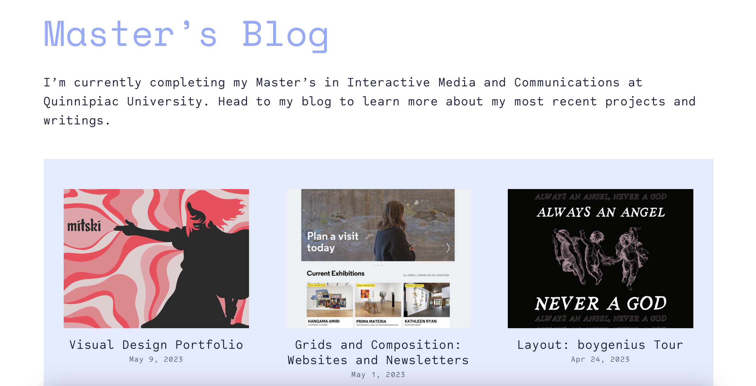
This also led me to create a new portfolio section of my website to start maintaining an archive of all of my projects that define the work that I do.

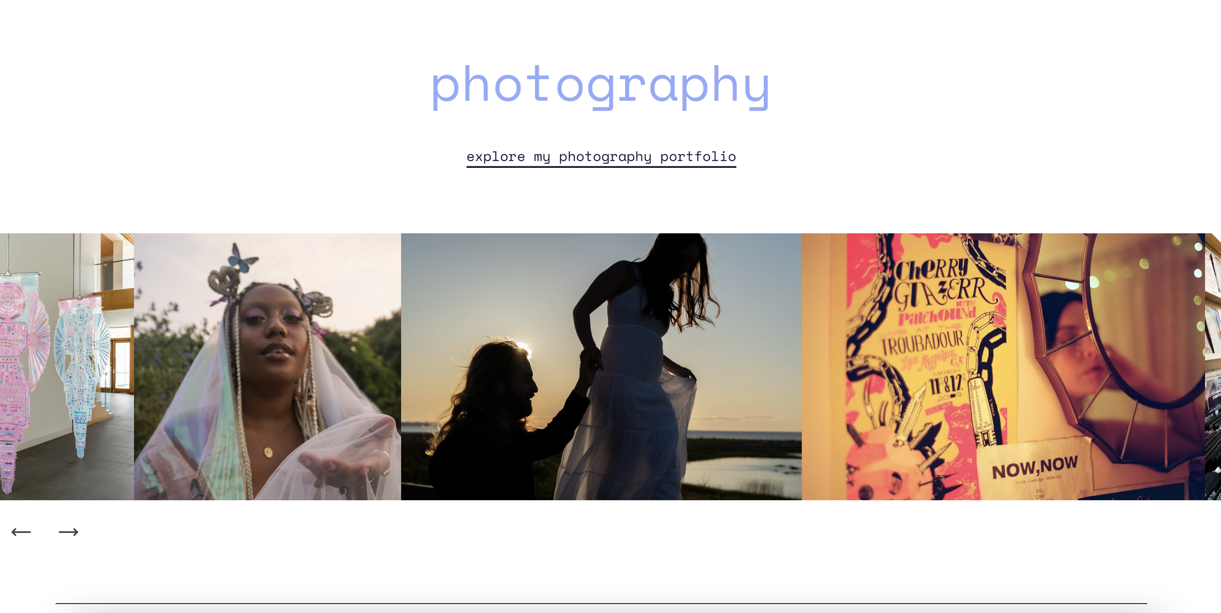
Overall, while this process took many surprising turns filled with challenges, it was both necessary and rewarding to take my website to the next level. It represents both my work and myself much more than it did before and I hope it might inspire you to embark on your own website journey as well!

